
Business card design do’s and dont’s
First impressions count, and this is especially true regarding business. A professionally designed business card gives a sense of legitimacy to your company and brand. Strategic, well-designed business cards have the power to help you stand out from your competitors.
By investing time in your business card design and business card printing, you are sure to leave a long-lasting impression.
At Easi-card, we help you design and print unique, quality business cards. But when it comes to business card design best practices, there are a few “dos” and “don’ts” to consider. Follow along to see what we mean.
The don’ts - what not to put on your business card
Bad typography
Don’t make your card hard to read for your customers. You may think a calligraphic and italic font looks attractive, but can it be read easily? Ask your customers, and they will probably say no.
Always consider your client and what they are looking for, know what they want and market to them. You don’t want them to squint their eyes at your business information. They will probably throw your card away if you don’t get to the point.
Keep it simple and easy to read. Please don’t use comic sands; it has no place being there anyways.
For example, the card below is not what you want to be doing:

All the fonts are different, making you look over the card for more information. You do not want your customers to work for you. You want them to come to you knowing exactly what you do.
Another point is not to minimise the size of your text because you want to add more information. Instead, leave out some unnecessary details to ensure a readable business card.
A smaller font may look perfectly acceptable when looking at the screen's design, but it will not be the same when printed. The font will be difficult to read. The general rule is not to go smaller than 8pt.

Popular Business Card Fonts Include:
- Times New Roman
- Baskerville
- Futura
- Telegraf
- Helvetica
- Adelle
- Swiss
- Monterchi
- Montserrat
- Black Caviar
You can never go wrong with Times New Roman, so if you want to play it safe, you know what to do.
Don’t go too wild with the colour.
Colours certainly give your business card an eye-catching advantage over a typical black and white print. But if you use colour, make sure you only use colours that align with your corporate branding.
You cannot start adding rainbow colours to your card if you are a law firm and your primary colours are navy blue and white. It just wouldn’t present your company well and might confuse your customers.
For example, below, your customers may get confused that this is the same company.
You remember Suzie’s company with blue colours and white font, but now she has designed it with different colours. I don’t know about you, but I’d be confused.


However, brightly coloured cards should be used by businesses that embrace a creative company culture. It would make sense for a digital agency to create an eye-catching colourful design, but would it apply to a law firm? Probably not.
In the same breath, never underestimate the power of simplicity.
A simple black and white business card are often considered classy, professional, minimalist and stylish. You should work alongside an experienced graphic designer and printing company to create this classic look.
Now, depending on what type of company you are in will determine what kind of design you’re going for. If you’re stuck, contact one of our friendly staff members, and we will be happy to help.
Avoid bleed mistakes
Bleed? What do you mean? The bleed area is an extended area around the outside of your card that will be cut off during production. You mustn’t have any text or pictures in this area. You will have your background image enlarged to the edge of the bleed.

The safe zone is where no text or images are put, just in case your card is cut close to this area.
The bleed area is 3mm. So, make sure to leave that area open for your design.
Awkward sizes & shapes
When designing your business card, you will usually have a standard CR80 card 54 mm x 86 mm.
A curvy, fun design is great for an industry in a creative company but isn't very professional for other companies.
Never forget who you are targeting! If you have a weirdly shaped business card that cannot easily fit in a wallet or purse, is it practical, or are they just going to throw it away after giving it to them?


Now that’s more like it; you know exactly what this person does for a living.
Do’s - what you should do with business cards
Spruce up your card
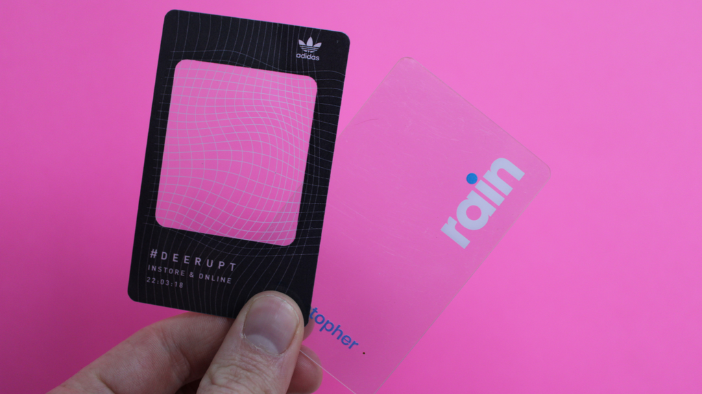
Your business card is to use an exceptional finish. Frosted, clear, or spot UV may add to the cost of your business card. They make your business card more appealing and memorable.
Here are a few examples of what we have done:


These just add to the feel and design of your card and make it more appealing for future customers. Suppose you have no idea what you’d like but want something different. Contact us, and we will help advise you on what’s best for your company!
We design these cards professionally in our factory, you can send us your artwork, and we will be happy to create it for you.
Spell check

Would you trust that business if you received a card with spelling errors or looked tatty? No, if anything, you would be worried.
You must get approval for your business cards properly before sending them to print. Get a second eye to look at the text and speak to us about the printing process. Ensure your design works with the printing process. Once you are 100 per cent sure of your business card design and content, sign it off and send it to print with us! We usually take 7-10 working days.
Design in CMYK
When designing your card, you want to ensure your colours are in CMYK, not RGB. Every design software will have an option; even Canva does if you want a simple design.
Designing in CMYK will ensure that the colours do not change when you print them. It will be the same colour you saw on your laptop when you created the business card, and that is what you want.

Best design software:
- Canva
- Adobe (Express - free).
- Affinity
- Logaster
Emboss your cards

This is an example we did, it’s not a business card, but it works. If you are worried that your plain black and white card is dull, then why not spice it up with some embossing. Embossing creates a raised 3D finish to your cards, as shown with the numbers above.
Not only is an embossed card aesthetically appealing, but it also makes it more tactile and engaging. The more attractive your marketing material, the more your potential clients will remember your business; this is an excellent design choice if your business embraces style, class, and elegance.
Keep it visual
A picture is worth a thousand words. It needs to get straight to the point. Yes, you need to have some text on your card, but you don’t want to overwhelm the viewer.
To sum up
At Easi-card, we understand and appreciate the importance of business cards. We have included business card pricing and business card promotions to suit any budget.
Our team work with you to ensure the ultimate result. From design to delivery, we are the printing company for you.
Contact us for more information on our business card prices and specials.
